From time to time, it’s a good idea to update your site to reflect modern web design trends. Internet users come to expect certain aesthetics, responsiveness and themes. If your website was created 10 years ago, it’s probably looking pretty dated now. Everyone has different preferences and you can never please every visitor, but these 8 design aesthetics should give you a few cutting edge ideas if you’re looking for something different. One thing you must never forget is that the user experience needs to be the most important factor in your overall design.
We didn’t include “responsiveness” as a trend solely for the reason that it’s been a trend for a while now and we feel that all NEW web development should be responsive. Having a mobile friendly website that looks awesome across all devices (mobile, tablet, desktop, etc) is crucial for digital branding in 2015 and beyond. Please keep that in mind as you read the 8 web design trends below.
[Tweet “8 modern #webdesign trends for 2015 via @mandymodgirl #8ways”]
Check out these 8 Modern Web Design Trends for 2015
1. Background Hero Images & Full Screen Videos Instead of Sliders
Sliders are a great way to showcase blog content, portfolios, videos, photography or news stories. Most sliders work on auto-scroll, allowing users to pause, stop or click through the different landing pages at any point in the slide. While still wildly popular, some designers are beginning to move away from sliders to focus on oversized “hero” areas featuring a large graphic header with a minimal amount of text. Large blurred backgrounds are popular among businesses like Paypal and others because they tell a story and capture the imagination.
Video is another great way to keep visitors on your site longer and prevent your page from growing stale. Y.Co Yacht tells their story through a full-screen video that aims to be just as fast-paced and exhilarating as a ride on one of their luxury boats. Born Group has an awesome moving background that transfixes visitors.
So, are “sliders” dead? Not so fast, we say! One reason our web design team at Mod Girl opts out of utilizing sliders on some of our projects is the extra page load time it requires. Using WordPress, we have to be very careful at what sliders we utilize, if any, as website speed is a crucial factor these days as no one likes waiting for a slow website — not to mention Google is now using site speed as a major factor in SEO. With that said, we still like using sliders on particular web design projects.
Check out the beautiful slider on Mod Girl’s latest web design project, Tampa Bay Plastic Surgery, Inc.
Slider 1

Slider 2

Slider 3

Slider 4

Related: Top 8 Reasons to Redesign Your Website
2. Parallax Scrolling
Parallax scrolling is a neat technique where the foreground images move faster than the background images. This technique can be used to breathe life into your page and add “wow” factor. It’s perfect for storytelling on single page websites. This was a hot trend in 2013, but a lot of business owners went overboard. This year, we’ll see more emphasis on multimedia product showcases and less text. Personally, we think parallax is fun… but infinite scrolling is not!
3. Slide-out Menus
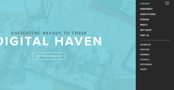
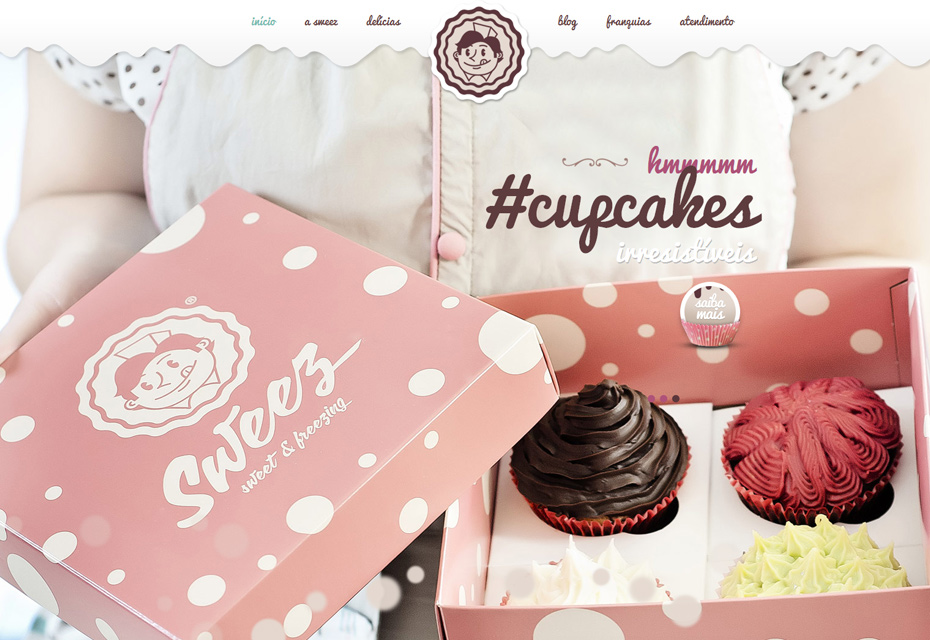
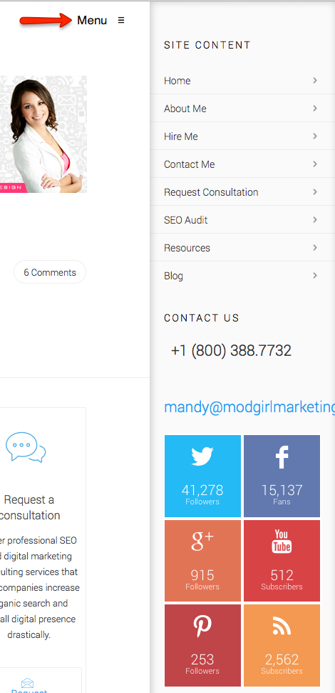
Some people find navigation bars to be too cluttered. Web design in 2015 has gravitated toward greater simplicity, so the slide-out menu bars (like Microsoft has implemented on Windows 8) are an extension of that desire. Users can access the menu by toggling to the top or side of the screen. These menus are especially great for mobile web designs, where space can be an issue. My newly designed #8ways site, which you are reading now, has a slide-out menu on the mobile version. If you are reading this from your mobile phone or tablet you can look in the top right corner, click on the “Menu” button and you will see the navigation menu slide out.
Here is a screenshot of what my slide-out menu looks like on this #8ways site, once you click the “Menu” button:
4. Fonts with Personality
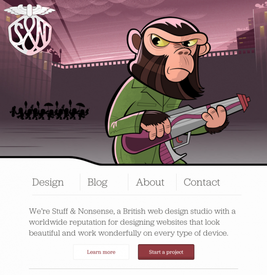
Long gone are the days where all sites use boring Arial, Helvetica or Times New Roman fonts. Designers realize that quirky fonts are a great way to add personality and style to a website, without adding clutter or bulky elements that may slow downloading time. This doesn’t ring true for every industry, as it would look odd to have a funky font on a serious corporate or healthcare website. Whereas industries that have room for a bit more creativity are embracing new, fun fonts. Check out these latest Google fonts.
Click to Tweet: 8 Modern #WebDesign Trends for 2015 #8ways via @mandymodgirl https://ctt.ec/MbcWA+
5. Flat Design
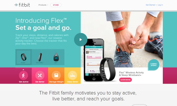
Say goodbye to gradients, beveled edges, reflections and drop shadows. Apple’s iOS7 brought us the first glimpse of “flat design” as we know it. Flat designs often use bright colors to jazz up a simple layout. It has been the rave for most of 2014 and we anticipate many designers to continue utilizing flat design well in to 2015.
6. Videos Instead of Text
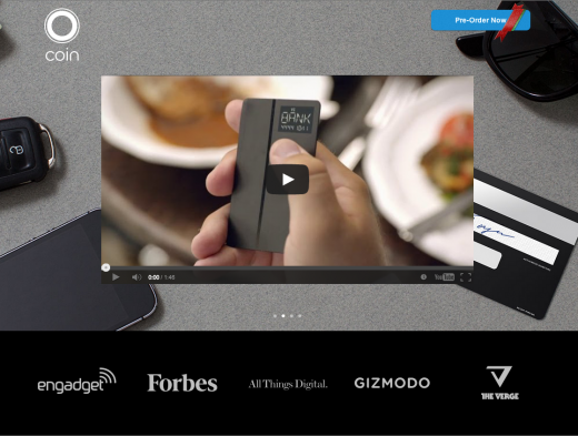
Web design is simplifying. Professional caliber videos are getting easier to produce. Not to mention, attention spans are shorter. The marriage of all three ideas brings us to an increased focus on using video to tell a quick story. Sometimes videos can slow down a page’s loading time, so they should be used judiciously, but they can work great to explain a complicated topic or make a quick impression. For instance, General Electric uses a lot of videos to give information on their products. Mod Girl uses a video on our homepage with a strong call to action.
[Tweet “These 8 #webdesign trends are popular in 2015 via @mandymodgirl #8ways”]
Related: Top 8 Best Female Web Designers
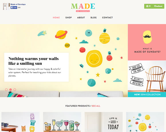
7. Hand Drawn Illustrations
Illustrated images, icons, typography and backgrounds add uniqueness and creativity to your site beyond the usual business stock images business site visitors see all too often. Like photos, illustrations are going big and bold in 2014 and 2015. A lot of retro and vintage styles have been coming back in vogue. This trend is not new to 2014, but it’s certainly not waned in popularity at all. This style won’t work for every business — especially if you’re a super corporate B2B, but it works for any business looking to tell a creative story with their website.
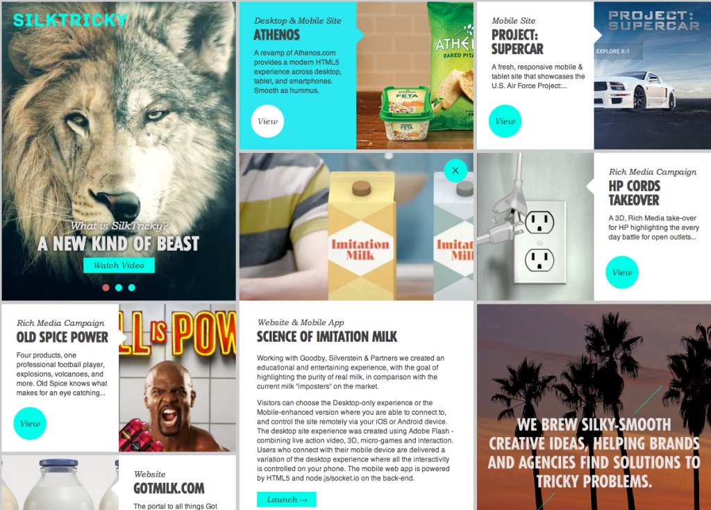
8. Cards
If you look carefully, you’ll find that information is often arranged in little “business cards” or “tiles.” Websites like Google, Twitter, Pinterest and Spotify are all using this web design trend to share information in easy, digestible ways. Some may say cards can be a little cluttered looking, but others argue that it’s intuitive and follows how mobile apps are displayed.
Need a website design consultant?
I can help! Whether you have your own team of developers and just need some help with the initial phasing like design, layout, optimization, keyword research OR you are looking to outsource it all. I’ve worked with companies large and small, helping them to develop high-converting, beautiful websites that not only rank well in Google but are so user-friendly that bounce rates stay under 10%. Want to be sure I’m the right fit? Take a look at my consulting services here, portfolio here, and client testimonials here.
I absolutely LOVE the design and UX element of digital marketing and prefer to work with WordPress when creating beautiful, digital real estate.
Feel free to contact me at any time for a brief, no-charge consultation.
Did we miss a hot web design trend for 2015? Sound off in the comments below and let us know what you think about the future of web design!


We will be upgrading our site prior to year end.
Help!
Hi Gary, good to hear from you again! I’ll send you an email and will see if we can help you out.
I like this.
Websites that don’t support retina graphics can look blurry on devices with high pixel densities. The trend has seen an uplift of universal font-face glyphs craze and renewed interest in SVGs (scalable vector graphic).
Do you do UK web design / services or only US? Thanks
Hi, we also provide web design services to the UK. Feel free to email me for more information – mandy@modgirlmarketing.com Thanks for your comment and for reading my blog post James.
Useful post…
Impressive post. Any chance you will be posting modern web design trends for 2016? Thanks.
Great Post! please share more content on newer trends.
Hi there! Glad you enjoyed the blog. We actually do have an updated one for 2018, which you can read here: https://www.modgirl.consulting/web-design-trends-biggest-changes-coming/
Mandy McEwen, would you update this for 2019 too?
Greatly presented. It is very useful. Looking forward to more interesting posts.
This is excellent stuff and worth exploring as i also belongs to web and mobile app development industry. I will surely share this stuff with my team as we need to stay updated with latest trends in web design and development.
The web world is changing at a rapid pace. What’s a trend today might be horribly outdated in a matter of a few months. With the year 2021, we are looking to embrace the future to seize new opportunities. Excellent reading here
This is a really good post. Is there any possibility you’ll cover 2021s hottest web design trends? Thanks.