With 75% of people judging your credibility based on how your website looks, good web design isn’t optional; it’s a necessity. Your website design helps set your site apart from others and serves as an important aspect of your company’s branding, and if you’re not keeping up with the latest web design trends in 2020, your site will quickly begin to look outdated.
Web design trends in 2020 can be applied to many forms of design beyond just your website, such as graphics for your social media accounts, as all social media platforms become increasingly media-heavy.
And although tools like Canva and Animoto allow you to create images and videos quickly and easily, if you don’t have someone on your team who specializes in graphic design, you might want to consider outsourcing the work to a freelancer or white label agency.
Discover the 3 secrets to successful outsourcing in my free training video today!
Website Design Trends of 2020
In 2020, web and graphic design trends are going to break the boundaries of safe and simple. Here are some of the biggest web design trends in 2020:
Vibrant Colors
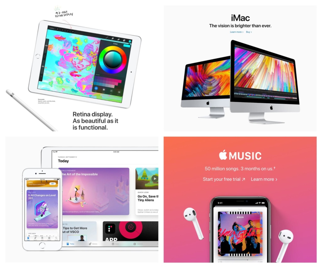
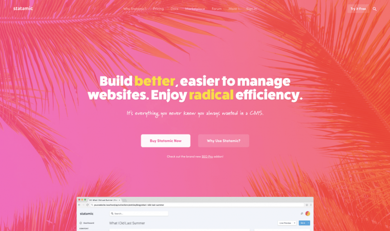
Vibrant hues and bright gradients started to make a comeback during the past few years, and are continuing to do so with regards to web design trends in 2020.
Designers are expected to be bolder when it comes to their color choices, including supersaturated colors and vibrant clashing shades to catch their audience’s attention. Improvements in technology have allowed screens to reproduce richer colors and made this website design trend possible.
Many brands have begun utilizing vibrant colors and duotone in their designs, and this graphic design trend is expected to grow to greater heights in 2020.

Modern Retro Art & Custom Graphics
In the past few years, we saw a lot of images and typography with nods to 80’s and 90’s influences, such as pixelated images. To be sure, retro art with a modern twist has been huge in website and graphic design.
This trend will continue in 2020. With regards to images and illustrations, today’s sleek modern vectors tend to be displayed and combined with throwback colors.
Web design trends are becoming bolder every year, with 2020 expecting a surge in graphic design that features retro illustration, abstract geometry, and complex gradients.
Many brands (especially those known for being fun and energetic) will continue to utilize custom illustrations and animations, created specifically for their websites, to delight visitors and inspire interaction. Brands considered to be more serious can also jump in on the fun, making them seem more “approachable.”
In line with this web design trend in 2020, we’ll see more website backgrounds with a retro feel to them, courtesy of creative patterns that have an old-school wallpaper feel.

Bold Typography
2020 will see brands growing bolder in their design. We can expect an upswing in strong typography that makes text easier to read across a variety of devices and which pairs nicely with the other bold design elements that will be popular in 2020.

The Biggest Web Design Trends in 2020
What else is coming in 2020? Check out all of the latest web design trends:
- VR Panorama
- Surreal Product Photos
- Zero Gravity
- Realistic Textures
- Abstract Data Visualization
- Yellow Backgrounds & Accents
- Multimedia Portraits
- Earth & Sky 2.0

Big Changes Are Coming to Web Design in 2020
With improvements in technology, designers are experimenting and having fun with their creations in ways they couldn’t before. And with more vibrant colors, abstract shapes, broken grid layouts, and bolder designs overall, 2020 is shaping up to be one of the most fun years for web design in a long time.
There’s a lot more to a successful business than just a great website, however. Discover how you can land 6-figure clients again and again with our free Digital Marketing Strategy & Audit Proposal template.
Updated November 15, 2019


I still think that minimalistic designs with very little color will do very well. Not for everybody, but for quite a lot of people the simple and visually appealing design is the go to. The minimalistic design as text being the only design format you can change and there is not a lot of detailed images or small text. Everything has to be laid out so that reader can focus on text very easily. That’s design I think will be successful as well as the mentioned ones will.
For sure, minimalism is still a very big trend! Thanks for reading. 🙂
This is a great detailed breakdown of classic web design as well as trends that will enhance any website. Thank you!
Glad you found it valuable! Thanks for reading.
This post was really helpful. I’m just starting to better understand snippets. What’s interesting is that I thought it was far more technical than that and that I’d have to do some coding. Nope, just structure content well and write good content.